Guest blogger: Helen

Friday, 28 May 2010


When I was in Bricklane the other day, I loved this wall I saw in a cafe - very inspiring! Illustrations as interior decoration seems to be a growing trend across town.


The wall graffiti continued outside.. I think art outside is even better than gallery art as it takes on a new context and meaning with it's surroundings.


Graffiti is becoming more accepted these days, especially with artists like Banksy helping legitimise it.


Above and below are two pieces of street art that caught my eye for the emotional power of the designs.


What I particularly like about street art is the anonymity of the artist. Check these out if you're around the Brick Lane area, and as Banksy did a lot around Brick lane, for all we know maybe some could be by Banksy himself!

Secret Post club

Thursday, 27 May 2010

I have just joined Heather's (over at the Notes from Lapland blog) secret post club. You are allocated a person and send them a gift, then a separate person is allocated you and sends you a gift.

They are given your blog address so they know what you might like. This is what I received this month - I had completely forgotten about it so it was fun to receive the package. I laughed when I opened it and love it, so thank you very much Smocha over at catsonthecounter.blogspot.com Click here to see more information on the Secret Post club - if you like surprises I'd highly recommend it.

Sloane Street bursts into bloom!

Wednesday, 26 May 2010


I was just walking along Sloane Street the other day and couldn't believe the flower displays outside so many of the shops. The giant peony ballerina pumps outside French Sole,


extravagant Edwardian style blooms outside Tiffanys,


a rose studded heart outside Paule Ka,


this incredible giant flower outside Cartier,


accompanied by Alice in Wonderland flower toadstools,

and a teapot of peonies inside the window. Completely magical. Tomorrow I'm going to Chelsea Flower Show so expect another floral post soon!

Anzu trade show

Monday, 24 May 2010


We are busy packing up, and will be exhibiting at Progressive Greetings Live tomorrow. Do come and see us! (Sorry that it's for trade only).

Stand no. 639
Progressive Greetings Live, The Business Design Centre
Islington
London N1 OQH
Anzu Ltd.

Guest blogger: Bonny

Friday, 21 May 2010


I thought it might be fun to have some of the Anzu team do some guest blogs, so here is the first one from Bonny - over to you Bonny!


This summer London is not just full of tourists from around the world; we are also embracing a parade of 258 elephants in town! The Elephant Parade is a conservation campaign for the urgent crisis faced by endangered elephants in Asia.


Decorated by different artists, designers and celebrities, these life-size baby elephant models are brightening up the city, even popping up to surprise us among concrete commerical buildings. The Elephant Parade runs from May to July 2010 and is London's biggest art event on record! The organiser (www.elephantfamily.org) aims to raise £2 million for Asisan elephants as well as 20 UK conservation charities.


This panda elephant is one of my favourites!

All the elephants are for sale by auction, and every bid placed is a bid for the enviroment - which one would you choose? The passion that has been poured into the project is amazing and lets us appreciate the beauty of these beautifully decorated elephants whilst also helping an enviromental cause. I hope you enjoy the elephant's company this summer!

To go on the elephant tour or see more pictures of the elephants click here

Vespas

Monday, 17 May 2010


If I wasn't so scared about falling off, I'd love to get a Vespa


I was delighted when the Berkeley covered their Pret-a-Portea delivery scooter in my illustrations - so exciting.


This would be great to go to work in - perhaps I could persuade Jasmine to drive it!


But I think this is the coolest idea of all - a repurposed Vespa as rocking horse.


How happy does this little boy look? I think he is very lucky indeed - to have a toy like this, but even more so to have the clearly devoted and creative grandfather that made it for him. You can read more on the story here

And finally my scooter illustration printed on one of our cards.

Images courtesy of: still from Roman Holiday, the Berkeley, Vespa, Greenwalla via the Poetichome blog, and finally Anzu.

I want to go to this:

Friday, 14 May 2010


I always thought the Great exhibition of 1851 looked so amazing, with all the nations of the world exhibiting their products and culture be it the world's first voting machine or yellow arsenic from China. The Koh-i-Noor, then the world's biggest diamond was also displayed.


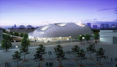
Following on from this tradition, the Shanghai Expo which has just opened now looks equally amazing with pavilions representing different nations. Above is the Chinese pavilion, the 'Oriental crown' which has halls for each of the different regions of China.


The Japan pavilion looks rather like some creature from a Miyazaki film and is said to be a 'breathing organism' in which a double layer membrane will filter sunshine into the inside of the building. Intelligent robots will also play a part inside the pavilion!


The Polish pavilion was inspired by traditional Polish folk art paper cut outs.


Inside the South Korea pavilion.


The UK Pavilion has 60,000 transparent acrylic rods containing seeds of different plants collected in a bio-diversity project.


The Dutch one looks like a fun park but I quite like it nonetheless. Known as 'Happy Street' it is shaped like the number 8, a lucky number in China.


Inspired by a ballet about a fairy-tale, the Danish pavilion combines outside and indoor areas joined in a circle and is meant to represent the best aspects of Danish city life.

See here and here for more information and pictures about the Shanghai Expo.
And thanks to Bonny for sending me some of these images!

Urban fairytales

Wednesday, 12 May 2010


Walking through Soho the other day, I was really surprised to see this streaming from a window. The room that the hair flows into is literally full of hair! An urban style Rapunzel for modern day.


The photographer Eugenio Recuneo likes to explore the modern fairytale, and I think his photographs are really interesting, whether it's snow white or the princess and the pea.


And below Tim Walker's take on the princess and the pea.


And for a modern day Heidi the hair on this season's catwalk would be just perfect,


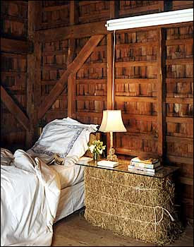
as would this guestroom as featured in the New York Times.

Images: own taken on Beak Street, Euguenio Recuneo, Tim Walker, unknown, New York Times.

Busy painting

Friday, 7 May 2010


Excuse me if I go quiet for a few days - it is because I am doing this, only not so artfully and not in skimpy shorts and a bandana.

Image via Sanctuary

Covent Garden flower market

Wednesday, 5 May 2010

I think these images by photographer Guy Boursell (found via the Ancient Industries blog) are just so inspiring with how distinctively English and old-fashioned they look. It is really hard to imagine present day Covent Garden with its mix of shops and restaurants once looking like this.
The dalmatian is certainly the perfect accessory for this dandified gentleman
All very reminiscent of the film, My Fair lady. Below is a great photo by Bob Willoughby of Audrey Hepburn and George Cukor on the set which recreated the Covent Garden flower market.


Images: 1,2,3,4 courtesy of Guy Boursell via Ancient Industries blog, 4 courtesy of Bob Willoughby.

Wardrobe

Tuesday, 4 May 2010


After another morning spent battling trying to a) find things in my wardrobe and b) get things out of it, I am dreaming of something a little more well thought out. Above and below is Mariah Carey's unbelievable dressing room


Can you imagine?


Like the funky neon sign on this dressing area photographed in the Selby,


mirrors, Pucci and roses in Paris Hilton's closet,


and not sure I have enough jewellery for this!


I also really like this more masculine look. Above is Belgian architect Vincent van Duys' dressing room - the paintings really make this room I think.


Images 1 and 2 Instyle magazine, Image 3 Selby, Image 4 via pseriesstylist, Image 5, 6 via the Habitually Chic blog and 7 Metropolitan Home also via the Habitually Chic blog